Coyeee | Japanese brand adaptation
Coyeee | Japanese Brand Adaptation
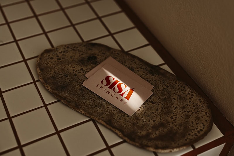
Client: Coyeee (Japan)
Agency: Carlin Creative (Paris)
Sector: Fashion & Apparel | Intimates
Services: Brand Extension, Stationery Design, Print Collateral
Date: 2012
The Challenge: Translating Japanese Aesthetics into Print
Coyeee was a Japanese underwear brand known for its specific visual identity. In 2012, the challenge was to take this established identity and meticulously adapt it for a full suite of corporate and retail communications. For a Japanese fashion label, the aesthetic often demands a high degree of “white space” and exact proportions—meaning there was zero margin for error in the layout or print quality.
The objective was to ensure that every touchpoint, from a simple business card to a formal letter, carried the same premium, minimalist “vibe” as the apparel itself.
The Solution: A Study in Minimalist Brand Continuity
The Endless Coconut focused on the systematic adaptation of the Coyeee identity, providing a suite of professional, ready-to-use collateral that respected the brand’s Japanese heritage.
- Strategic Brand Adaptation: We took the existing Coyeee logo and engineered it for various physical formats. This involved determining precise placements and scales for business cards and letterheads to maintain the brand’s refined visual balance.
- Cohesive Stationery Suite: We designed a unified system that prioritised clean typography and intentional layout. By focusing on a minimalist aesthetic, we allowed the brand identity to act as the “hero” across all materials.
- Technical Print Precision: We managed the file preparation with a focus on high-fidelity output. For a brand where quality is a core value, the tactile experience of the stationery—paper weight and print clarity—had to be perfect.
- Providing Professional Ease: We handled the heavy lifting of the brand rollout, delivering a complete “plug-and-play” stationery kit. This provided the client with total relief, knowing their corporate communications were as polished as their products.
The Strategy: Honouring Heritage through Design
This project demonstrates our studio’s long-standing capability to support international brands with complex rollout requirements. By maintaining strict adherence to Japanese design principles—clarity, precision, and balance—we provided Coyeee with a professional foundation that communicated quality at every level. It is a testament to our ability to handle established identities with the respect and technical excellence they deserve.
The Result: A Polished International Face
The final stationery suite provided Coyeee with a sophisticated, unified face for their business. The project remains a benchmark in our archive for how we bridge the gap between an established fashion identity and its physical brand manifestations.